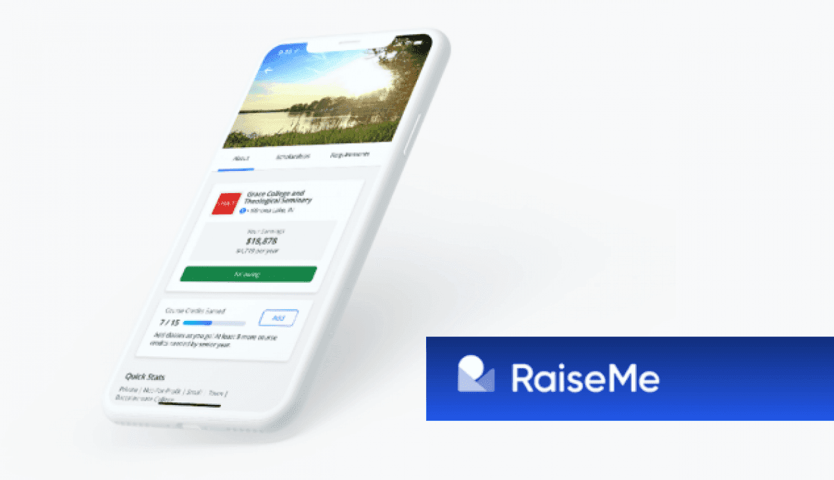
Over the past five years, San Francisco-based startup, RaiseMe, has been effectively turning this unfortunate reality around in the form of micro-scholarships, which students can earn for everything from good grades and extracurricular activities to family assistance and part-time work.
When RaiseMe came to STRV for their iOS, they needed a product that perfectly complimented their award-winning web-based platform. In other words, they needed best-in-class.
REWARDING GOOD WORK WITH OPPORTUNITY
With affordable education being the hot-button issue it is these days—currently one of the most dominant talking points in American politics—it’s hard to overstate how valuable the work being done by RaiseMe is to today’s higher education landscape.
The fact is, college and private universities can be expensive, with average annual tuitions ranging from $10,000-$40,000 a year. For many students, especially those from lower-income communities, these costs represent a barrier to entry, discouraging would-be enrollees from even considering applying to many schools in the first place. This is the exact problem the micro-scholarship system was built to address.
RaiseMe works like this.
Students, starting as early as 9th grade, are invited to enroll in the RaiseMe micro-scholarship program. Once approved for eligibility, students can proactively add or browse through a smorgasbord of achievements that can earn them micro-scholarships ranging from a few hundred bucks to a few thousand, which they can earn for classes they’ve completed as well for sports, AP classes, after school programs, community service and more.
RaiseMe, as a tool, not only clears a pathway towards a college degree but also exposes students to a broad range of college and university options which they might not otherwise have considered to be an option for them. It is in this way that RaiseMe represents a genuinely unparalleled opportunity for empowering students to take control of their own futures like never before.
Currently, the average total earnings for RaiseMe students is in the area of $24,000, with the potential of culminating upwards of $80,000 over time. As of spring of this year, over 1.9 million students have been awarded nearly $4 billion in financial aid.
These are all impressive numbers—numbers which have grabbed the attention (and investment) from several tech-for-good industry heavyweights, including the Chan Zuckerberg Initiative, Salesforce Ventures, and Strada Education Network. Additionally, RaiseMe also made Fast Company’s prestigious, World’s Most Innovative Companies for 2019, which honors organizations for making profound impacts in industry as well as culture.
When the time came for RaiseMe to bring this one-of-a-kind program to iOS, one thing was for certain, it had to have all of the intuitive navigation, functionality, and features people had come to expect from their web platform. For more on this, we sat down with STRV iOS engineer, Matheo Fiebiger.
Give me some background on your work with RaiseMe.
We started two years ago in February. At that point, RaiseMe had their own backend, frontend, and design team and this great website but needed a native mobile app. They wanted to launch by August to coordinate with the start of the new school year. Their team supplied the designs, I built the app from scratch, and we iterated a couple of times. Since then, I’ve handled all of the development of new features as well as general maintenance of the app.
How was the app received?
It’s been quite successful, actually. Not only have the App Store reviews been great (currently rated at 4.8 and in the top 100 for education) but it was also featured as App of the Day. For me personally, it’s one of my best-rated apps ever.
RaiseMe’s vision for the app was to translate their web experience to mobile. Was there any additional functionality created specifically for iOS?
The app does have some cool features. It works offline, so it has a local database and then syncs the data once it connects. Students can also sync their phone book to easily share referrals, earning a $100 micro-scholarship for each of their friends that joins the platform.
Ultimately, over the past two years, the majority of the focus has been placed on UX in order to meet RaiseMe’s needs. Is that a fair statement?
Yes. The app is about presenting information and allowing students to add their own, so having nice design and ensuring it was user-oriented was key. Since the mobile app is primarily used on the go, there was a real priority placed on making the UX as smooth as possible while presenting lots of information. It’s also built to be accessible, so features like text-to-speech are there.
What would you say has been the most rewarding part of working on the project?
What I’ve liked about working on RaiseMe the most is that it’s not like working on just any other app. This app actually helps people, especially those coming from lower-income families who want to go to college in the US, which is quite expensive. To give kids a chance to be rewarded for doing well in school, well… that’s pretty cool.
Thanks, Matheo.


