To be STRV is to face the unknown with excitement. We eagerly await what’s next because our world is never stagnant, and following the thread of curiosity always pays off. So, if something’s evolving in a fearless direction, it’s got our attention.
One such thing has surfaced pretty recently. When Microsoft released the Surface Duo, we couldn’t help but get excited. This is exactly the inventive, status-quo-breaking attitude STRV admires.
The Rise of Dual-screen?
Now, we are not telling you to go and buy yourself a foldable phone because that’s the future. The adoption of dual-screen devices is no small feat and comes with its own set of challenges. A notable challenge — arguably the greatest one — is the reason for this article.
If we don’t support it, people won’t use it. If people won’t use it, why support it?
This Catch-22 logic often decides whether a trend survives or ends up in a technology graveyard. So, here comes the question with no easy answer: “When should we start supporting dual-screen devices?”
After much deliberation, our team’s answer is… drumroll, please...
The Answer
It depends.
Yeah, kinda anti-climactic. But the answer depends on so many factors, on such a variety of client needs, that giving one definitive answer is impossible. (What sort of factors and needs, specifically? Learn about our approach to project estimation.)
Does that mean you shouldn’t care about these users for now? They are but a handful, hardly worth the extra effort to support these devices... right?
Well, not really. As with niche screen sizes or older browsers, sometimes you don’t need to provide first-class support as long as your product is usable. Such is the case with Surface Duo; just make sure your page is not broken on a dual-screen device. While it may seem like the bare minimum, your users will appreciate it. After all, surely you don’t want the first thing the user sees to look like this:
STRV + DUO = ❤️
At STRV, the sort of “good enough” approach mentioned above isn’t enough. It’s in our nature to embrace challenges rather than side-step them, which is why we’re able to proudly unveil our very first web app with first-class dual-screen support.
STRV App Cost & Time Calculator
Well, “unveil” may be the wrong word, since we already spoiled the surprise with the images above. But the example we showed is prior to any dual-screen optimization. We can do better.
STRV App Cost Calculator
Just to briefly introduce the concept, in case you didn’t explore it on your own using the link above: Our calculator lets you select which features you’d like your mobile app to have. Based on your needs, you receive a ballpark cost and time estimate.
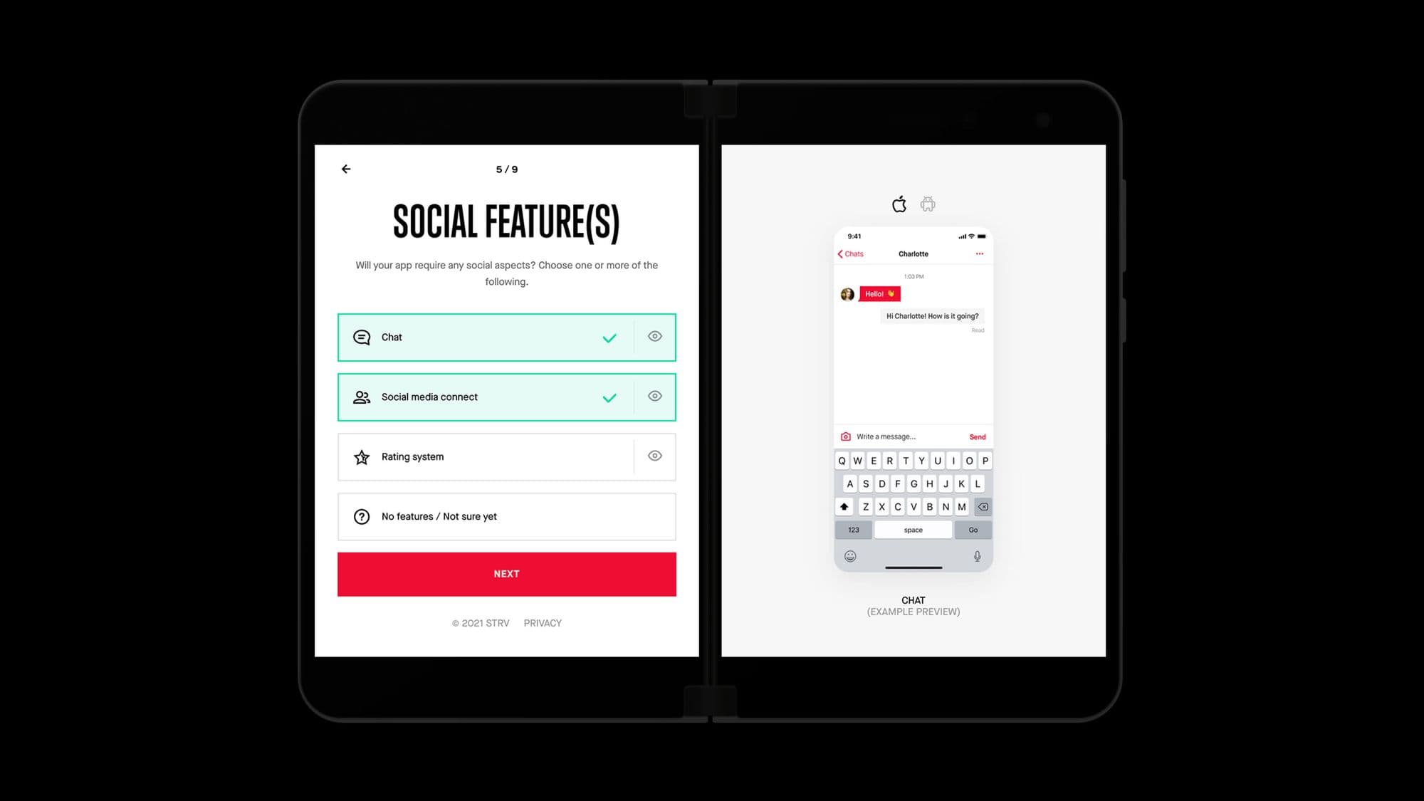
When it comes to the Surface Duo, having twice the regular screen real-estate allowed us to include some nifty extras which wouldn’t fit on a standard mobile device. One such example is the preview of the selected feature, as seen in the screenshot below.
By leveraging the secondary screen, we can use the List-Detail pattern and provide users with a better experience by utilizing the visual feature previews.
The dual-screen also simplifies layouts. What was previously a single-column scrollable view can now display all necessary information at once, like this:
Our primary content is always on the left screen, which also includes our main calls-to-action. Therefore we can use the right screen for supplementary content, moving all secondary actions to there.
Last but not least is our Thank You page, which is the final step in our user flow. Here we opted for displaying a list of our mobile app case studies, to accompany the message on the primary screen.
Our Duo Experience
This was our first experience with first-class dual-screen support. We made some mistakes, but the final result is well worth it — as you can hopefully agree.
From a technical perspective, the biggest headache with the Surface Duo is arguably the seam. It’s a non-standard feature we had to work around, and it basically required that we reinvent how we arrange content.
Thankfully, Microsoft offers helpful guides on how to accommodate the seam in your styles. By following those, we created a universal layout component that follows Microsoft’s best practices and common dual-screen patterns. This lowered the barrier of entry, as even pages low on content–such as our home page–look good without devs spending extra time on meticulous styling.
The most important thing we had to re-learn is our approach to screen space. With Duo, a website spanning across two screens shouldn’t be treated as one big space, but two separate screens. Things like horizontal centering put content right on top of the seam and bottom menus can easily end up split in half, usually in ways we least want. That’s why we found it important to contain different sections within a single screen.
For those interested in learning more about supporting Surface Duo and similar devices, we recommend the Introduction to Dual-screen Devices and Dual-screen Web Developer Documentation.
Final Thoughts
It’s hard to predict the future, as our crystal ball is currently broken. We can’t tell you whether dual-screen devices are just a gimmick, the next big thing or something in-between.
What we can tell you, however, is that as developers, it’s our responsibility to accommodate new trends by adding the necessary processes to our repertoire. After all, usability is accessibility — and we should strive to make the web accessible to all, no matter what device they use.


