Featuring content made by Bazzell and Anthony, along with respected players like Trae Young, Napheesa Collier and Candace Parker, Through The Lens (TTL) stands out on star power alone. But it wanted to enter the market with more than that, to exceed comparable platforms.
The team was well aware that training videos of unmatched quality made by elite athletes are a great start; but in the digital space, it’s not just what you can offer, but how you present it.
STRV was tasked to package TTL content in a wholly unique way. An ambitious task — but we had an ace up our sleeve. Our now-Creative Director, Patrik Fuzesi, just so happens to be a massive basketball fan. So we put him on the project, sat back and let him do his thing. (Case Study with more visuals and collab details coming soon.)
We spoke to Patrik about how passion affects the design process, the challenges of merging sports and exclusivity and, as the tricky cherry on top, what it takes to design a content-centered platform… before you’ve seen the actual content.
Note: Because the platform quickly gained a substantial following, TTL has now entered its next stage — currently under development, as seen on the website.
“Let’s start at the end. The final design was deemed by the client as capturing his ‘wildest imagination’ of what TTL could be. How’d you do it?”
This project was a dream come true for me. I got to combine my biggest hobby with design. From the beginning, this felt special and I think my enthusiasm was visible in every detail.
Understanding the topic and being a huge fan of it helps a lot with creativity. Not just with the design itself, but with how to communicate that design. Since I know the audience — how they speak, their tone of voice — I was able to leverage all of it.
My excitement was visible in every detail, including the placeholder copy within the designs, like basketball slang and what information to use where. While that’s someone else’s job, having the right stats in a player’s bio or a heading that hits the right message ties the design together.
“What was it about our initial design concept that immediately grabbed TTL’s attention?”
Our design concept showcased what we could do for TTL really well, but I think what really “sold” STRV was the full package — the passion we had, the story behind the design and how we told it during the concept pitch.
For the client, knowing that you’re enthusiastic about the topic, showing that you know what’s going on in their world… it all goes a long way. You can’t fake that.
“To make TTL stand out, where did you start your design process?”
After identifying the target group as basketball fans and enthusiasts willing to pay for such content, I gathered inspiration from platforms tailored for the same community, specifically basketball brands: how they communicate, show the product, etc.
Applying my knowledge about the NBA, I also knew it’s deeply connected with fashion and a certain lifestyle. Everything around it is bold, with sleek design — so much so that functionality sometimes takes a backseat to how it looks.
TTL had to have unusual visuals and an unusual layout (most comparable platforms stick to one formula) while remaining functional. You can’t reinvent the wheel in places where it’s unnecessary, since users are used to working with certain patterns. But you can reinvent details like how you showcase the players, so it’s eye-catching and memorable.
“How did the platform’s visual details come together to create the ‘perfect’ look?”
Basketball brands and sports brands in general are united in boldness, so I turned to bold typography. However, where TTL differs from the crowd is that it offers luxurious content. I had to combine these two relatively opposing worlds.
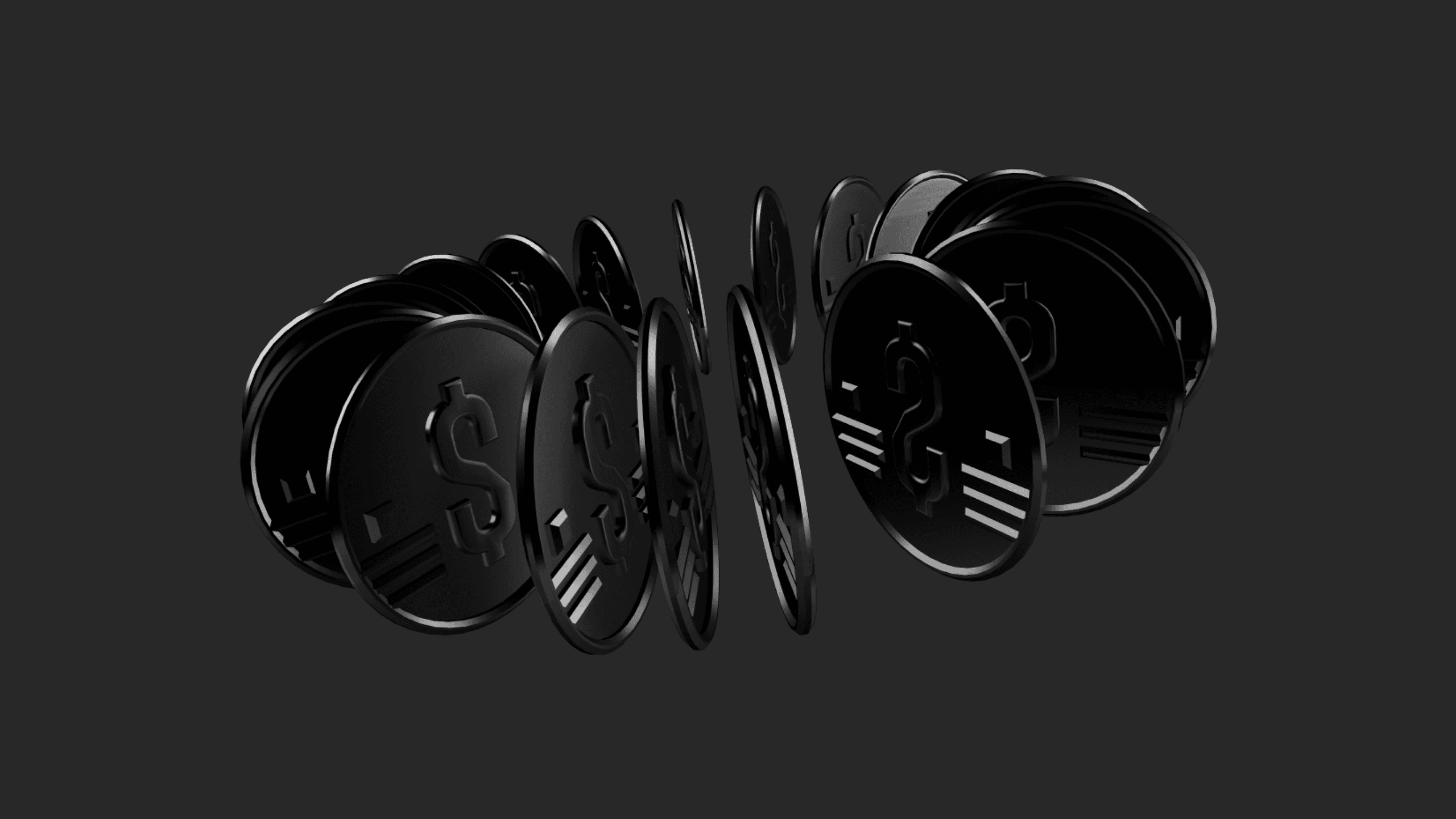
As I was creating the overall concept, the client came to us with an unusual ask: using the color gold. This was a curveball because working with gold in digital design is pretty challenging.
Once I’d found a shade of gold that looked nice while being easy to work with, I united it with our vision. The gold highlighted the lucrative aspect of TTL very well, keeping everything else black allowed the content to stand out — but the overall look remained bold and polished, not flashy.
“The designs had to be prepared while we didn’t have TTL’s video content to work with. How unusual is this and how does it complicate the process?”
Very, very unusual and makes the process so much harder. Designers need to see the content they’re working with (such as photography art direction, video direction, etc.) to create the design around it. Since I had no idea what those videos were going to look like until the end, I had to get creative with the process.
I used a variety of placeholder images that were very general and represented all possible edge cases so that no style felt out of place. When creating presets and overlays, I had to consider that the final images could be colorful, or black and white, or completely white, completely dark… It’s a lot of extra steps to ensure the design could work with absolutely anything.
“During the Engineering Phase, you worked very closely with our engineers to ensure zero deviations from the designs. Does this make a big difference?”
It makes a huge impact on time efficiency. There’s no waiting for feedback, no back-and-forths about minor tweaks. Plus, there’s no better way to ensure pixel-perfect results.
Our TTL designs included a lot of carousels which can be a nightmare for engineers. Although we always create a Style Guide and Design System that helps with implementation, it’s great to tackle some complexities side by side.
By having everyone under one roof, our engineers shot me a message whenever they were struggling and I was there in five seconds so we could figure it out together — the engineer coding and me checking out the result live, going, “Move this a little to the left, now up…”
In fact, even during the Design Phase as I was working on unusual layouts, I’d check in with our engineers to see if the complexity was doable and how many limitations it comes with.
“When working with a client that doesn’t have any tech experience, what’s important to keep in mind?”
With Alex, it was crucial to put myself in his shoes and communicate with him on a level that made sense. I didn’t burden him with font sizes but, instead, I dug into what he was trying to communicate on every screen and we went from there.
On any project, you’re always learning, researching... Especially when someone isn’t a tech person, you can’t expect them to tell you exactly what you need to do. It’s important to take what the client gives you and expand on it on your own time.
With TTL, since each course was divided into episodes and each episode consisted of workout videos, I had to research how to display such content to make it easy to find and intuitive enough to work with. I also needed to take into consideration that there will be people watching the videos on the court while practicing, so the experience had to be seamless on every device.
“You’re known for having strong, tight-knit relationships with clients. How did you establish this sort of connection with TTL?”
One big thing was staying aware of what Alex was up to on all fronts. When he told me he’d be showing certain screens to a player outside of the project, I tailored those screens to that player — using his photos, scrolling Instagram to see what he likes and including it in the design — to make the design as appealing as possible.
It’s really about being hyper-aware of your client’s responsibilities. What are they dealing with on the business side? Are they pitching to investors? If yes, help them score every person’s enthusiasm by customizing the content. As I've spoken about in the past, you are in this together. And especially during the Design Phase, you're also partners. How can you go beyond what’s expected?
